Usability Review of Peer's Website
Reviewed Website: View the Website
Prominent Terms
One of the first things I noticed about the website is how well it highlights important terms. The headings are large and easy to spot, making it clear what each section of the page is about. This is essential for helping users navigate quickly and understand the content at a glance. However, the visual hierarchy could be improved slightly by using techniques like bolding keywords or adding contrasting colors to make key terms pop even more. These subtle enhancements would further elevate the website's readability without overcomplicating the design.
Clickable Elements
The clickable elements on the site, including buttons and links, are very intuitive. They are easy to identify, and the hover effects provide helpful feedback, making it clear when a link or button is interactive. All the links I tested worked perfectly, which is always a relief when reviewing usability. This ensures that users can navigate the site smoothly without any broken links or confusing elements. I didn’t notice any issues here—this aspect of the site is already well-designed and functional.
Design Distractions
One of the strengths of this website is its clean and focused design. There are no unnecessary elements or visual distractions that could pull attention away from the main content. The simplicity of the layout ensures that users can focus on what matters most, which is always a plus. A minimalist approach like this works well for usability because it reduces cognitive load and keeps the experience straightforward. I wouldn’t suggest changing anything here.
Text Scannability
The text on the website is short and to the point, which makes it easy to read and understand. Although there aren’t many headings to break up the content, this doesn’t feel like a problem because the text is concise enough to avoid overwhelming users. That said, adding subheadings in longer sections of content could be helpful in the future, especially if the site grows and adds more detailed information. Subheadings would also improve scannability by allowing users to quickly locate specific information.
Happy Talk
The content on the website avoids unnecessary “happy talk” or filler text, which is refreshing. Instead, it gets straight to the point and delivers useful information without wasting the user’s time. This concise style aligns well with usability best practices and ensures that users can quickly find what they’re looking for.
Navigation
The navigation menu is one of the standout features of this website. It is easy to locate and consistent across all pages, which helps create a seamless experience for users. The menu highlights the current page, providing clear feedback and improving the overall usability. Additionally, there’s always a quick way to return to the homepage, which is an essential feature for any site. I couldn’t find anything to critique here—the navigation is simple, intuitive, and highly effective.
Homepage Purpose
The homepage does an excellent job of communicating the website’s purpose. From the moment you land on the page, it’s clear what the site is about and what kind of information you can expect to find. The design strikes a good balance between being informative and not overwhelming the user with too much content at once. This is a great example of a well-thought-out homepage.
Suggestions for Improvement
- Add more visual hierarchy to headings by bolding key terms or using contrasting colors to make them stand out.
- Introduce subheadings for longer sections of text, which would make the content easier to skim.
- Consider incorporating small design elements, such as dividers or background colors, to give the site a more polished look.
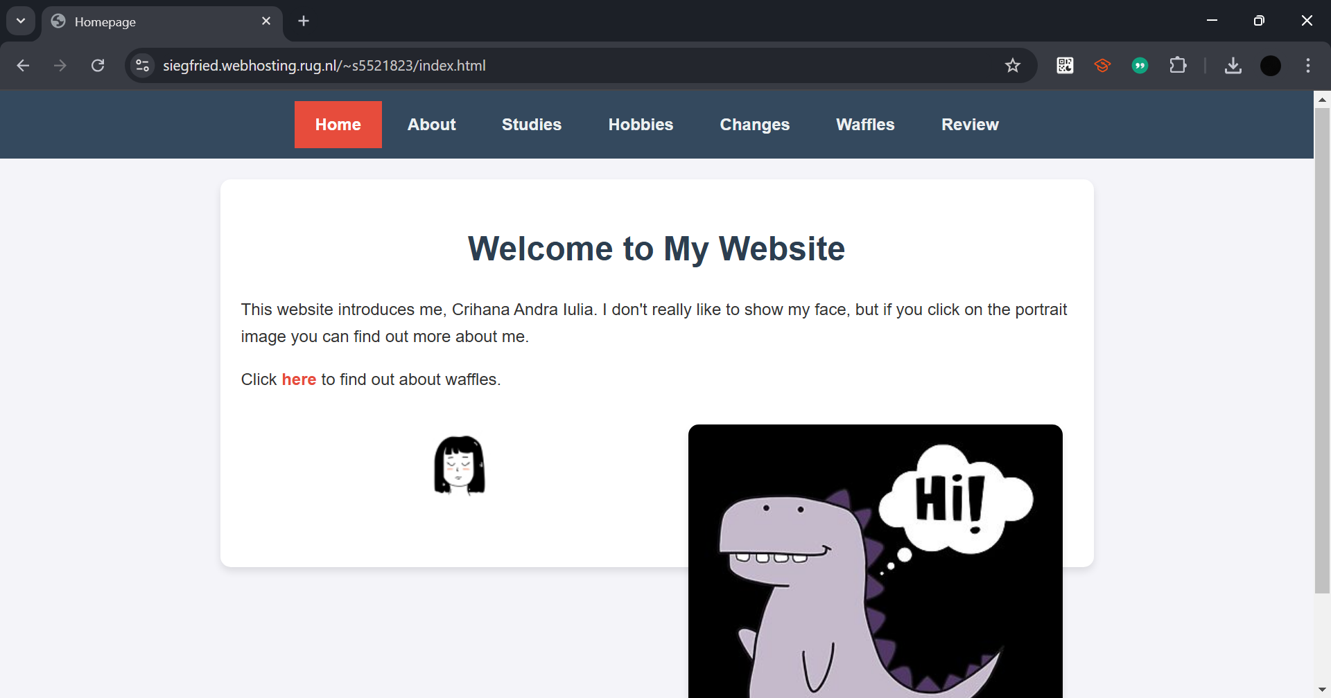
Screenshot of Reviewed Website