Web Usability Review for Monty Slater
Monty Slater's Homepage
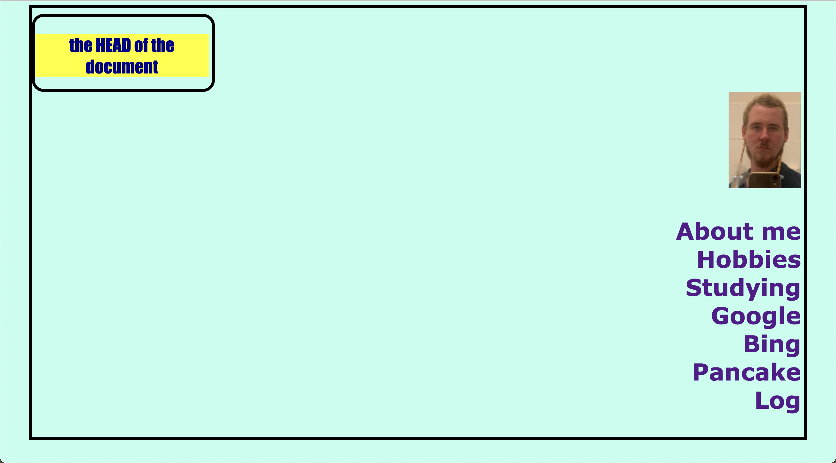
Monty's website has the menu items on the right side of the screen, but the website might look more organised if they were in smaller font and at the top of the page. The contrast of the website is uniform and the the size of the font as well. However, I think that it would be easier to read if the font were a bit smaller, which would make the site look cleaner and more organised.
The headings/titles of the page are visible, indicating which section of the website you are on. The most important term of each page is also displayed as the most prominent one using a bright colour like yellow and large font.
When the page first opens, it is not that obvious what can be clicked on. To fix this, I suggest the menu items should hover in a different colour to let the user know what page they are on and what they can click on. The design of the website is still minimalistic and could use more pictures or different background colours/images. The log page is still quite empty and lacks updates of what was done during each week. Overall, there isn't any distraction on the website.
The texts on Monty's website are easy to read because there is very little text. The website does not contain any happy talk text but the sections on the website could use more elaboration. Some of the pages are incomplete and most don't have the button to go back to the previous page; the user always has to go back to the index instead of being able to click on the page they want to go to.
The user navigation should be at the top of the page so the website looks more organised and so the user doesn't have to constantly scroll down. The website has a homepage link called INDEX, but it should probably be changed to Homepage so it is more clear to the user. There is a 'you are here button', but it would be better if it was in a different coloured font.
The website so far indicates that the website is about who Monty is but also has extra elements such as Bing and the Pancakes page. The website also shows that one can simply learn more about who the creator is a person. Finally, I would suggest that the creator add more pictures and more elements to the website to make it more inviting for the user. I also suggest fixing the width of the banana pancakes images to make the quality of the image better.
To see Monty's website for more details click the link below.
Monty's Website
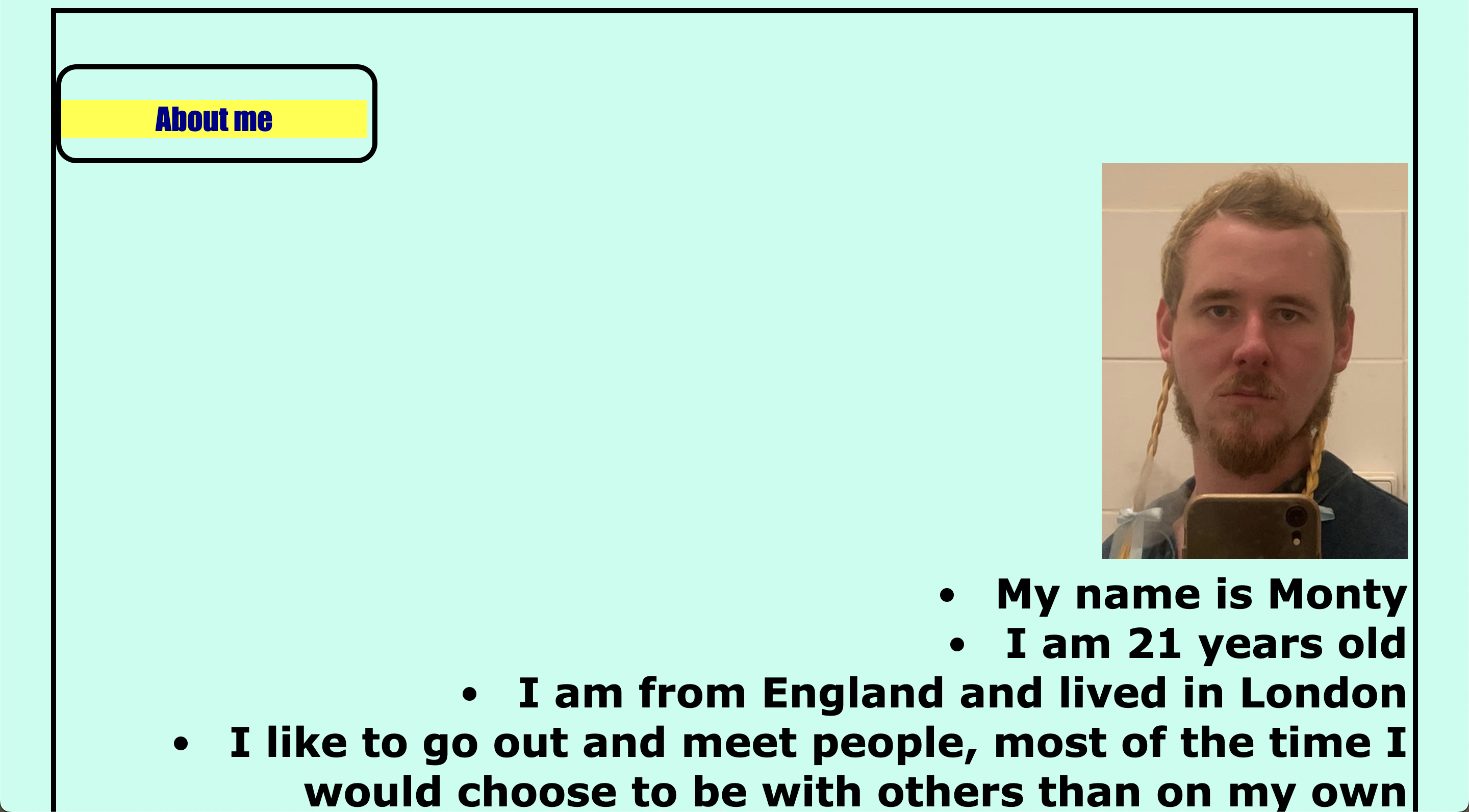
Monty Slater's About Me Page