Review of a peers website
Today I will be reviewing Eva Postema's website.
You can visit Eva’s website here.
Usability Review
Key Terms and Prominence
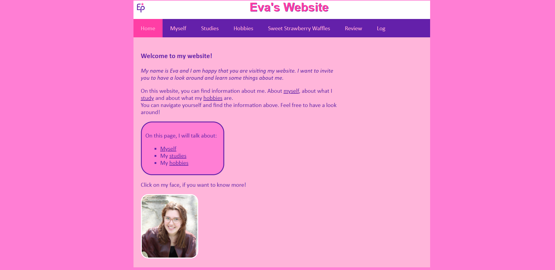
On her website the most important term on each page is evidently displayed as the most prominent one, where for example she very greatly incorporated links to her pages where she talks about myself, study and hobbies into a paragraph where she explains what the website is about, as well as this she has underlined these links which make them stand out more to the user. All her pages clearly have a heading where it explicitly states what the specific page is about.
Clickable Elements
She did a great job in showing what is clickable for the user by underlining the certain links to pages, as well as this on her homepage and myself page she states "click on my face" making it clear to the user that the thumnail is clickable.Distraction or Design Noise
There is minimal distraction or design noise. The layout is clean, and the content is easy to focus on, enhancing usability.
Text Scanning
The texts are extremely easy to scan for example she put certain texts that are important to the page in bold as well as the subheadings, and italic text into small descriptions about some things on her pages. As well as this, she incorporated bullet points making it easy to read what she has written as oppossed to just reading a full paragraph. On her sweet strawberry waffles page she made it extremely readable with the bullet points and bold text in the instructions and topping section.
Happy Talk
There is some happy talk present on her website, where the most evident one is on her sweet strawberry waffles page in the first paragraph, as well as on her studies page in the first paragraph too which makes it an extremely welcoming and positive experience visiting her website, it made me feel like I do not want to exit her webiste at all
Navigation
The navigation on the website is user friendly because first of all her horizontal navigation bar explicitly shows where exactly on her website you are located through making it active, so for example when i press onto one of the pages in the navigation bar it turns into a pink color indicating to me that i am on that specific page. As well as this, as I have mentioned before, she did a great job into incorporating links to other pages in her texts which makes it easy to navigate through and it is always at a prominent location. As well as this it is also consistent throughout her whole website which allows the user to navigate without any issues. On her pages in specific though there is no links to the homepage anywhere in particular, it is only in the navigation bar, so I would probably recommend for her to add on the bottom of each page in small text "go back home" so that the user that is looking at her website can easily go back to the homepage without a problem (although with her horizontal bar one could also easily do so). There isn't a specific indication on her pages stating 'you are here' but it is easy to know where you are on her website through her headings where she explains what the certain page is about as well as the active property in her navigation bar.
Homepage Clarity
The homepage clearly indicates what her webpage is about, as I previously mentioned, she incorporated links into her paragraphs where she explains what could be found on the website and also she added a little box that catches the users eye because it is a different color where she adds links once again and explicitly states what the webpage is about.
So far, I don't think that there needs to be much improvemment to Ema's website, I was pleasently surprised by how easy it was to use it as well as how nice her website is in general. The only improvement I would probably suggest for her to do is, as I mentioned previously, to add at the bottom links that bring the user back to the homepage but other than that I think she did a great job, well done!