Natalie's website is very eye-catching, due to the strong contrast between foreground and background. The visual hierarchy was effective, as she had consistent header, navigation bar, followed by main contents of the current pages that did not change positions or colours when switched pages. Due to the header being at the top and having a larger font size than the rest, made the more important term of each page displayed as the most prominent one. Furthermore, the title always corresponded to the smallers headers of the navigation bar. The navigation bar itself was user-friendly, highlighting the exact page you are at, making it much easier for the user to indicate where you are.
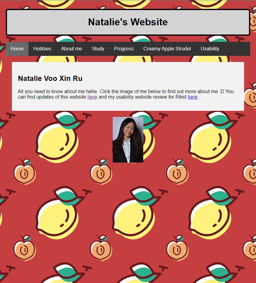
Now for the pages themselves, the homepage does indicate what this site is about and what you can do at this site, even providing links to different pages, regardless of the navigation bar. There is slight happy talk in the sense of text emotes, specifically the use of ':D', which makes the website look a little more welcoming. This however was used only once and only in the homepage. But aside from that, I did not find any other instances. I have also checked all of the hyperlinks, and all of them seemed to work perfectly! This is great since correct hyperlinks is important to ensure the user's appropriate and precise journey through such links. This included the photomap Natalie put in her 'About Me' page, which all led me to the appropriate pages telling more about her likes and interests, such as link to ducks as her favourite food, Oscar Isaac as her favourite thing to look at and Rick Astley's iconic song 'Never Gonna Give You Up' as her current favourite thing to listen to. It is worth to mention that these hyperlinks could be associated with the author's humour, which made Natalie's wesite seem more approachable and friendly. The image of her itself was very clear and did not lose on quality or seem pixelated, thus making it easier for the users to find and click on her specific face features.
There were some specific pages I wanted to comment, such as 'Creamy Apple Strudel', where I did not find a link to the original recipe anywhere. Furthermore, the entire website had very little amount of text, which made some pages seem redundant, such as 'Study'. Lastly, her 'Progress' page could use some text blocking and/or separation, instead of writing all of the updates in one block (making it a paragraph). This makes it a little harder to read and navigate through individual weeks, so it is recommended to maybe include some little sub-headers or space out the writing.
My recommendation would mainly be to reduce design noise or make the website a little easier on the eyes with better visual coherence of the main content compared to the background. This could be done by either changing the background or even changing the colours of the text blocks/headers to be in the same warm/summery colours as the background.
I would also recommend to add a little more text or images to some of the pages, to make the pages more entertaining to look through and read.
Overall, it was very easy to navigate through her website, due to multiple factors, such as consistency, layout and her navigation bar.