WEB USABILITY REVIEW
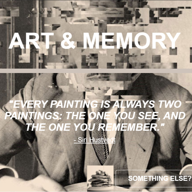
Hannah Zondervan's website is the perfect example of what one can do when starting to learn web design and is passionate about a topic. There is a clear visual hierarchy between pages and it is easy to follow and read. The titles and most important terms are bigger and have a darker color; clickable elements have a nice orange color that goes with the rest of the design and there is no distractions. Even the pictures used have been edited into a consistent theme that makes surfing the page easy and enjoyable
The text is easibly scannable and the navigation is really straight-forward and user friendly, with every component at the tob navbar as well as scattered throughout the related pages for easy access. The homepage doesn't really say anything about the webpage but it takes you to an introduction where the topic is epxlained. The final webpage covers a really interesting topic such as art and memories and does so in a beautiful way and with a cute and consistent theme.
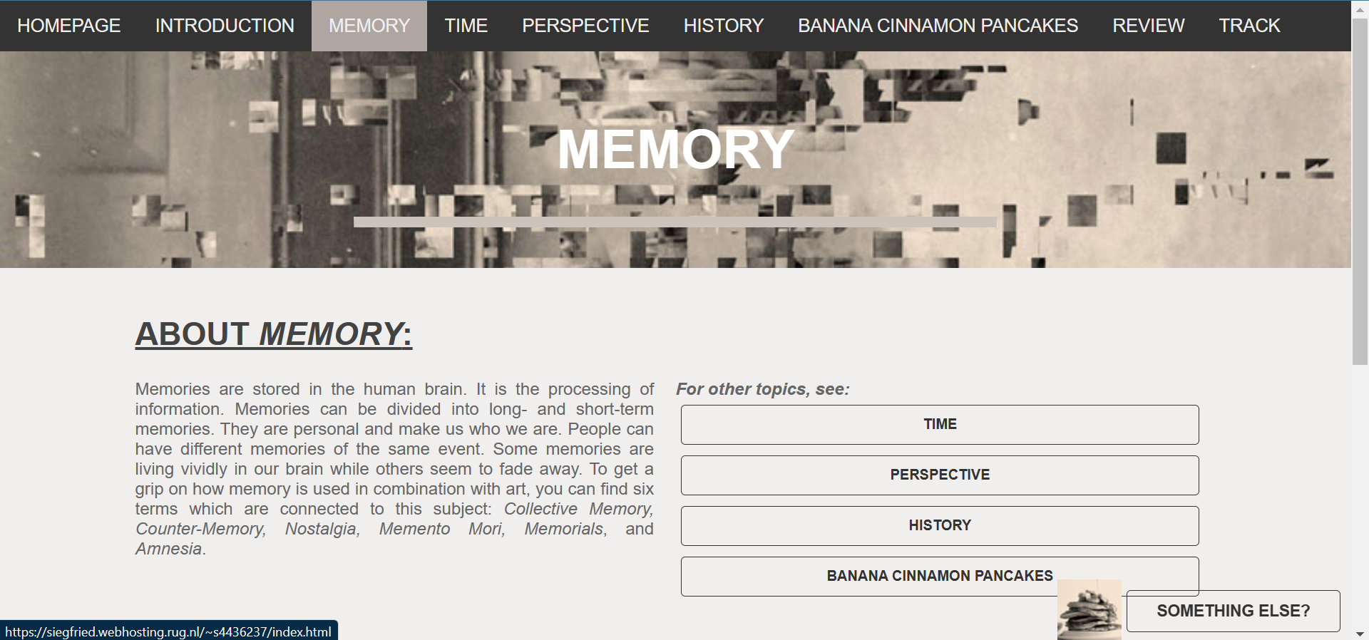
my one and only suggestion would be to either blur out the picture used as background in both the homepage and the titles or add a drop shadow to your white text, since those are some easy fixes to improve the readability of your text.