Usability Review
Click the image to visit Sterre's website
Let me start off by saying that it just so happens that I have to review my favorite page of the entire class. We're talking about sass, Jim Jarmusch references, multiple mentions of smoking, and France, what's not to love? This site oozes personality, and it's refreshing to see a webpage that doesn't take itself too seriously. But even the most stylish sites benefit from usability refinements, so let's take a closer look at how well this page functions and where it could be improved.
Design and Structure
The overall design supports scanning, with a clear header-content structure and well-defined sections. Page titles like "Me!", "Maison!", and "Progress!" are prominent and bold, which helps visitors immediately grasp the content of each section. However, some areas, particularly the Progress! page—contain longer blocks of text that could be broken up into shorter paragraphs, bullet points, or subheadings for improved readability. While the humor and playful stylistic choices make reading enjoyable, clearer visual structure would enhance usability for those quickly skimming the content.
Navigation
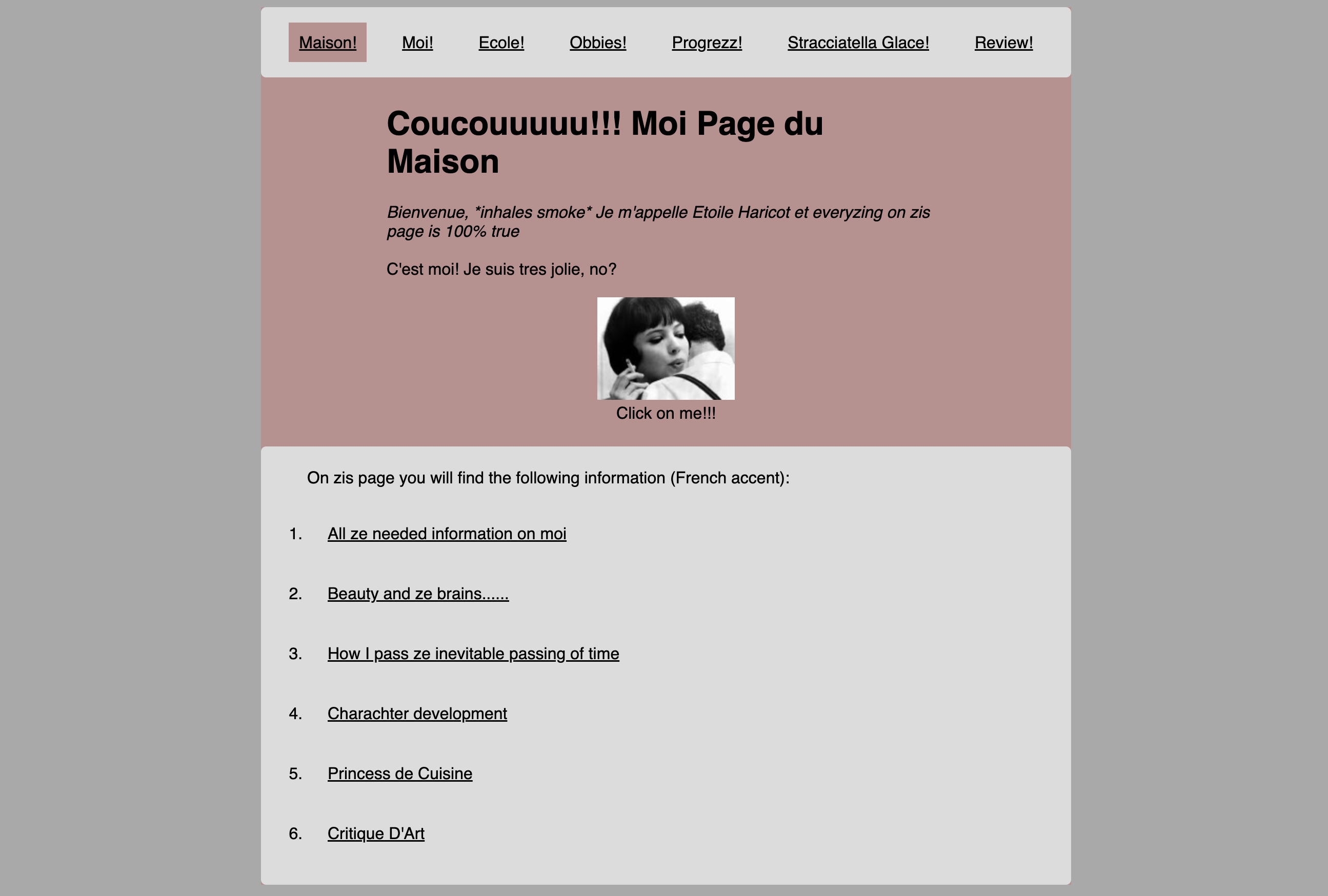
Navigation is intuitive and consistent, thanks to a fixed menu bar at the top of every page, ensuring that users always have access to different sections. The active page is highlighted, which is a great usability feature, making it easy to track where you are on the site. However, the homepage link ("Maison!") isn't immediately recognizable as a home button. Since most users expect a clear "Home" label or icon, adding a small home icon next to "Maison!" would improve navigation clarity.
Interactivity
Clickability is another area where minor improvements could enhance user experience. While the main navigation menu is clearly interactive, some clickable elements, such as the image on the "Me!" page are less obvious. The "Click on me!!!" text hints at interactivity, but a hover effect, underline, or cursor change would make it clearer. These small affordances subtly guide users, reinforcing which elements are interactive without disrupting the design.
Tone and Content
One of the most distinctive aspects of this site is its engaging and humorous tone. In usability terms, the presence of "happy talk" playful, conversational text that doesn't necessarily serve a functional purpose is typically discouraged, as it can distract users from key information. However, in this case, it adds to the site's identity without obstructing usability. The balance between humor and clarity is well-managed, though ensuring that essential details are easy to locate should remain a priority.
Recommendations
Despite the site's strong foundation, a few refinements would improve usability while maintaining its signature style. Key areas for enhancement include:
- Breaking up longer text blocks (especially in Progress!) to improve scanability.
- Enhancing visual indicators for clickable elements, such as images and embedded links.
- Increasing text-background contrast for better readability.
- Clarifying the homepage link with a small home icon next to "Maison!" for easier navigation.
All in all, I consider this page my favourite because it balances both functional tone and a very nuanced and sarcastic identity. It is vibrant in all things that matter, while anything allowing for improvement is of less value.
Nous parlons d'un vrai banger.