Student review
The website I reviewed is from Yigit Kirca Yigit Kirca
Design:
The design of the website is simple and cohesive. The title of each page is in the same font, also the same largeness, which makes it clear on what to expect on the page. You are able to click on the navigation bar, but it could be designed a bit clearer, by using a navbar, for active and (not) active and using a colour block, which will help the user identify their current location on the site more easily. Furthermore, the background comes across as calming and nice, it does not distract the reader from the text. Overall the design elements work together.Text:
The text on the website is very easy to scan, there is no use of happy talk. The text consists of short sentences or bullet points. This is beneficial for users who want to find information without wading through paragraphs. On the logbook page, called changes, it consists of longer sentences, but these are not difficult to read. Also week 5 has been added twice, this might be a small mistake.User friendly:
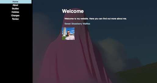
The website navigation bar is well positioned in the left high corner,it is a separate block. This block appears on every page and stays the same, so if you click on one page, you will find the navigation bar at the same location, this functions nicely and is a functional point in usability. The navigation bar does not consist of a link that brings you to the sweet strawberry waffles page. This page remains only to be found on the home page. The navigation bar does include a home page button, called home. The picture on the homepage is clickable and transfers you to the about me page. On this page you will find a larger version of his profile picture, where you are able to click on the ears, mouth and eyes. However, adding titles to these clickable areas would improve the user interaction by providing clarity, for example, hovering over an area could display a title like eating or sound. Such enhancements would make the feature more engaging and also clearer for the user to notice it is clickable.Homepage:
The homepage is very simple and effective welcoming users with the text heading that says welcome. This is nice, making the reader indeed feel welcomed. The homepage clearly communicated what the website purpose is; finding information about Yigit. However, the placement of the sweet strawberry waffle page feels out of place. Positioned directly under the welcoming message, it appears a bit random and disrupts the logical flow of the page.Usability improvements:
I would suggest removing the sweet strawberry waffles link from the homepage. It feels a bit random to put it under your welcoming sentence. I would suggest you move it to the navigation bar, to keep the homepage in its welcoming simplicity. Also I would add your name to the homepage, this can be valid information for the reader, while reading a website about you.