Reviewing Shamanty's Webpage
click on the image to visit the page
Shamanty's Page
A quick in depth review for Shamanty's usability page
Style Review
Is the most important term of each page also displayed as the most prominent one?
Yes, the titles presented in the starting part of the page are correctly displayed and representing each page's content
Is it obvious what is clickable?
Yes, all links have hover animated effects with color change that show what is clickable
To what extent is there distraction or design noise?
No noise or distraction is present, the website's simplistic nature allows the user to concentrate on the main content.
Texts Scannability
Are the texts easy to scan?
Yes, sentences are clear and concise. Presenting only relevant information for the reader.
Do you see 'happy talk'?
The current writing style avoids overly enthusiastic or vague language, which is a good practice for maintaining a professional tone. It's crucial to continue this trend of straightforward and concise language. The website should keep focusing on delivering the essential information clearly, maintaining an informative and approachable tone throughout. The absence of "happy talk" also ensures that the site doesn't come off as overly promotional, which can be off-putting to visitors who are seeking value-driven content.
Navigation Analysis
Is the navigation user friendly?
Yes, the navigation is placed in a convenient spot, where it's easy to see and interact with. It presents all of the webpages and offers tracking animations for which links are hovered and which page is active. The navigation bar present on all pages, offers the option to return to the home page at any time by clicking the first "Home" option. It also seems to be consistent across all pages.
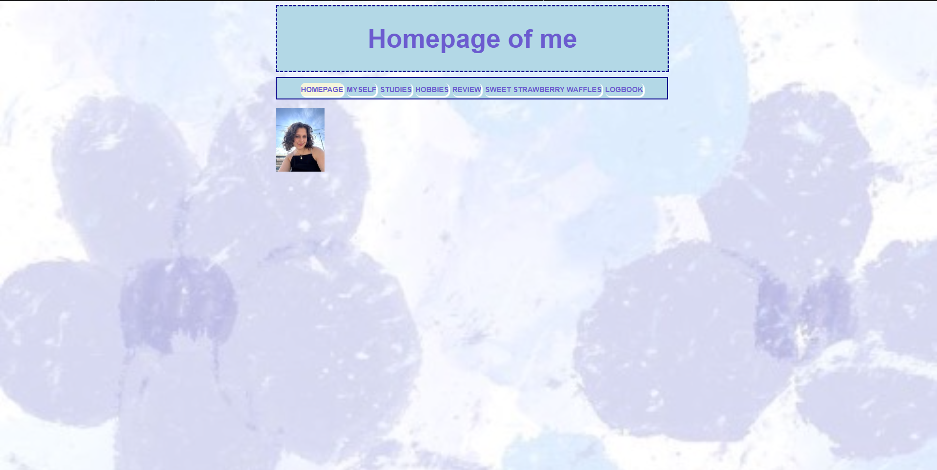
Homepage
Does the homepage clearly indicates what this site is about?
No, the home page only includes a single picture of the site's creator. While not a bad thing in itself, it does not indicate anything about the website other than it's creator picture.
Suggestions
What other improvements can I suggest?
Currently, the homepage might be too minimalist, with only the creator's picture being featured. This does not immediately convey the purpose or offerings of the site to the visitor. Adding a short introductory statement or an engaging hero image/video could better communicate the site’s purpose. The introduction could briefly explain what the site is about, what visitors can expect, and how they can interact with the content. A compelling visual or video that captures the essence of the website could draw users in and make the homepage more engaging.
Centering content on the page can help create a more balanced and visually appealing layout. This design choice ensures that the main content is framed well, drawing the user’s attention to the most important parts of the page. It's especially effective on smaller screens, where the content might otherwise feel lost on the edges. Maybe include a few links to external websites to boost SEO. On the same matter, the pictures seem to be missing alt captions which hurts the accessibility and search engine optimization.