Review of Myla's Page
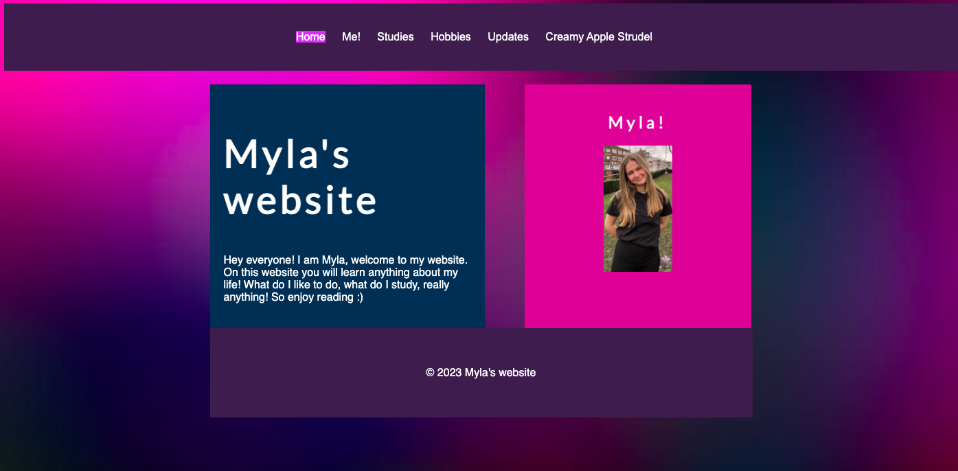
Myla has an aesthetic page colouring, having colours that work well together. The pages menu also has the an interactive element as we see which page is active through the background of said pages name being highlighted. this is very helpful for usability as we do not get lost easily while navigating Myla's page
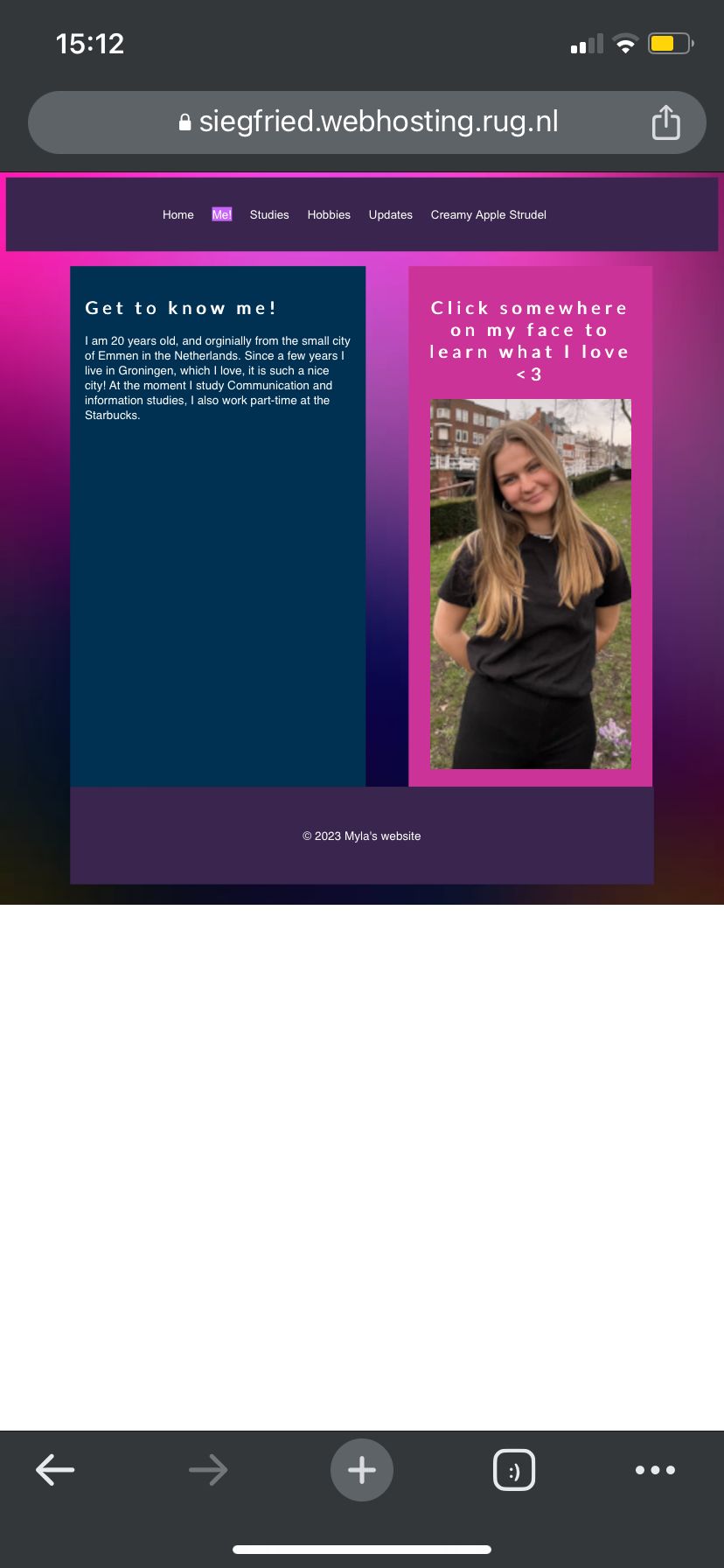
One issue is present regarding the pages is their length is not sufficient, my phone in portrait mode left the bottom half of the screen white (blank) as the page did not extend all the way to the bottom of my screen. To fix this I recommend not defining a length of the page, this way it will scale to the size / resolution of the device / screen accessing it.
The pages menu also has Myla has an aesthetic page colouring, having colours that work well together. Her pages are also consistent in this design telling me that she has applied an external stylesheet. The pages menu is located at the top of the screen on all pages making navigation easy.However the creamy apple strudel page has a different layout from the other pages, i am not sure if this is intentional but it seems a little out of place
The hierarchy of information displayed on the pages is great, which each section of text having headers / titles that quickly inform the user as to what they will be reading
The textual content of each page is relevant and provides a pleasant insight into who Myla is. The photos also contextualise some of this information, for example showing us Myla with her friends on the Hobbies page.However on the Me! page because the image has a far larger height than the accompanying text there is a large empty space under the text. To fix this Myla could put in another image underneath the text or perhaps have the image sit on top of the text,
The headers of each page do not coincide with the name of the specific page you are on. Each says Mylas website, as opposed to saying for example the page called Hobbies when one is on the Hobbies page.Myla has also added an interactive element as we see which page is active through the background of said pages name being highlighted. this is very helpful for usability as we do not get lost easily while navigating Myla's page
To increase the usability of this menu system Myla could implement code enabling a visual indicator when the cursor hovers over clickable elements. However due to the location of the menu being in a standard location for a menu any competent web user would assume these elements are clickable.The menu also using short words for each page means that the page is adaptable to smaller screens. I have accessed her page on my iPhone and the size of the menu meant that a side scrolling bar was not necessary.
The website does have a nice amount of pictures that keep the pages from being boring whilst also being relevant to what each page pertains to.
However Myla still needs to add her log page, detailing each week's progress both for herself and our teacher.To see Myla's website click the link below.