A review of the website
Click the image below to visit the reviewed website!
Scanning of the website
The website is not completely designed for scanning. The most important terms of each page are partly displayed as the most prominent ones. They do have a larger font-size and are displayed at the top of the pages, but do not really stand out as for example a bold font would do. The pages do not contain many links or clickable items, but the few items that are clickable are clearly clickable. For example, sometimes there is an accompanying text which states that an item is clickable and sometimes the color of the item changes when hovering over it. However, this can be made more clear by for example underlining the clickable items. Also, the picture on the homepage is clickable, but this is not made clear by a text or a change in scenery. This can be improved. The distraction or design noise is almost completely none, the is a clear background color and the font-family is almost uniform.
Scanning of the text
The text is quite easy to scan, because of the use of lists and headings. Also the short paragraphs makes it easier to scan the text. However, the improve the scanning some keywords could be highlighted and some more white space could be added.
'Happy talk'
The website does not contain much ‘happy talk’. Only on the homepage a little bit ‘happy talk’ was added but the following pages of the website does not contain any ‘happy talk’. This means that the pages directly state what is expected, resulting in easy to read and nice to read text.
Navigation
The navigation of the website is very friendly. The navigation is placed at a prominent location on the upper side of the website, which is clearly visible. Also, the navigation stays at the same location on every page, making it a consistent and reoccurring part of the website. The first link of the navigation is a link to the homepage, which is followed by links to every other page of the website. Within the navigation it has been made very clear on which page the visitor currently is. This has been done by changing the color of the clickable part of the navigation which the visitor is currently looking at.
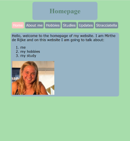
Homepage
The homepage shortly states what the website is about and what to expect from the other pages of the website. However, not every page is listed in the information block on the homepage. To find out what is on this pages, the visitor has to click on this item in the navigation bar. Nevertheless, the homepage does have a short text with what the other pages will talk about and this is listed in a ordered list which makes it clear, concise and nice to read.
Conclusion and tips
Overall, the website has a great usability level. In order to improve the usability some more there could be made use of more headings which can make the hierarchy of the page easier to understand. Also, this can be in the benefit of scanning the text, because the highlighted heading directly makes it clear what that page is about. As said before, to improve the usability, the picture on the homepage is clickable without clearly being pointed out as clickable. Here a short text or a change in presentation when hovering over the picture can help to make clear that the picture is clickable.