This is a usability review of the website from Bianca van der Veen.
The improvements for the usability are in different places in the text, based on the subject of usability they are about.
Prominence
The most prominent term is on every page is in my opninion also displayed as the most prominent. It is a title centered close from the top of the page in an own 'block', so clearly distinguishable from the other text and displayed above the menu balk. For the improvements for the usability I would add a text next to the flower saying something like: "homepage". Something that gives an indication of the homepage. For the user it is not immidiately clear that the flower is clickable. The flower is really creative, so that is something nice.
Clickability
All the hyperlinks in the text are clearly displayed by the line underneath and al the hyperlinks in the menu balk are clearly displayed by a clearly marked menu item. I would recommend to not implement the italic terms in the page 'myself'. The italic terms are differen from the main text and therefore can look 'clickable'. In the menu balk there are different pages you can visit by clicking on an item. I would add a border around the different terms. There is some indication of the different pages and not just words next to each other in a 'block'. This is done by the purple background of the pages you are at, indicating that there are more pages. The usbility, in my opinion, increases when you add the borders. This makes it more clear that the other words in the row in the 'block' are not just words, but more pages that can be'clicked' on. Since there is no line underneath any more, indicating a hyperlink, there should be some more information that gives an
indication the text is clickable. So this can be done by using a border, giving a feeling of a menu balk with different menu items that can
be clicked on.
Distraction/design noise
I like the purple background with the white flowers. It is really creative and in line with the design of the title page. However, the flowers can be a bit too much as a background. It is a busy background. Consequently, in my opinion, the flowers can generate design noise because they can be distractive for the main information on the website. The amount of text is not too much and therefore it easy to find your way trough and to scan. Furthermore there is not that much distraction. In the text area the background is white, without any distraction. The bold titles in the text help the reader scanning the text in a easy way. The text in my opinion is easy to scan.
Happy talk
I don't see much happy talk. The message is not introduced using many words. The message is clearly stated at the different pages. I like the quotes about here life, saying sometghing about her, without using happy talk in the sentences.
Navigation
Your navigation balk is in the center of the screen, so the location is prominent. The navigation is next to this clearly distinguishable, because it has an own 'block'. All the blocks, including the navigation balk, have a border around the 'block'. In my opinion the borders help to make the 'blocks' more distinguishable from eachother. It looks the same at all pages, so it is consistent. There is a clear indication of where you are on the website and where to find the homepage. This is done by a purple background of the page you are at. The purple background is consistent with the background of the whole home page and the flower in the title balk. This adds to the color consistency in general of the website. The homepage covers many pages of the website, including the sweet strawberry waffles. There is a link that leads the user to the homepage.
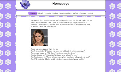
Homepage
The homepepage gives an indication of what the website is about, but to be precise: the indication of the review page and the changes of the website is not there. These could be added.
In general I really like the usability of your website.
My compliments!