Web usability review
Topics under review
Scanning
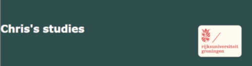
The pages Studies and Ice-cream gave the most important term of the page displayed as the most prominent one. The other pages, myself, about hobbies, photo and progress do not display a title or most prominent term on the page. The studies website that does include the depiction of the most important term does so on the bottom of the page.
It is very obvious what is clickable. The hyperlinks are a different colour from the rest of the text and are underlined. After clicking a link the hyperlink becomes a different colour, which indicates which link you have opened. There is no distraction or design noise, the pages clearly focus on the essential content. There are no distracting thick edges or striking background images, so very well done.
Texts
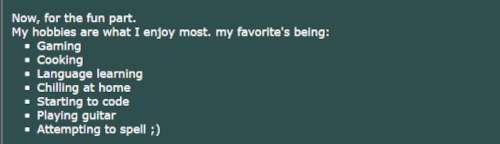
The texts are easy to scan, this is because most pages use lists, short paragraphs, white space and limited line width. Again very well done.
There is no happy talk, this could also be due to the fact that most pages do not contain a lot of text. The ice cream page contains the most text, luckily this text also does not contain happy talk as it is genuinely telling a story and explaining certain aspects of stracciatella ice cream.
Navigation
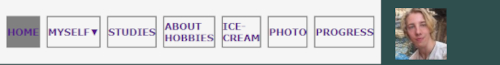
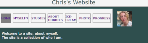
The navigation is very friendly. The navigation bar is at the top of the page, navigation bar itself is white whereas the rest of the page is green, which makes it standout. So I would say that the navigation bar is in a prominent location. The navigation bar is consistent, it is exactly the same for each page and as a nice bonus the myself button also has a dropdown feature. The navigation bar includes a link to the homepage. There is also a you are here indication, normally the background of the navigation bar is white but on the current page you are on the colour is grey.
Homepage
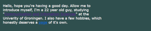
The homepage indicates what the site is about and it does indicates what you can do with this site. However the amount of text is very limited so as I said it does indicate what you can do with the site but I inferred this from the statement: the site is a collection of who I am., which could use some improvement as to truly convey what you can do with the site.
Further recommendations
Most pages right now lack a header which states what the page is about. For usability I would suggest using headings and maybe some bold text to specify the topic of a certain page or put more emphasis on what is important in a text.
In the navigation bar I would change about hobbies to just say hobbies, this both saves some space in your navigation bar as well as increase readability
Adjust the page width, right now a horizontal scroll bar appears when the page is viewed at half-screen width.
Conclusions
Overall the website is well structured with great navigation and clickable elements. The use of lists, white space, and colour contrast is well implemented. Minor changes to the headers, navigation label, and homepage content would enhance the usability of your website!