This web usability review concerns the website created by Julia Viziova
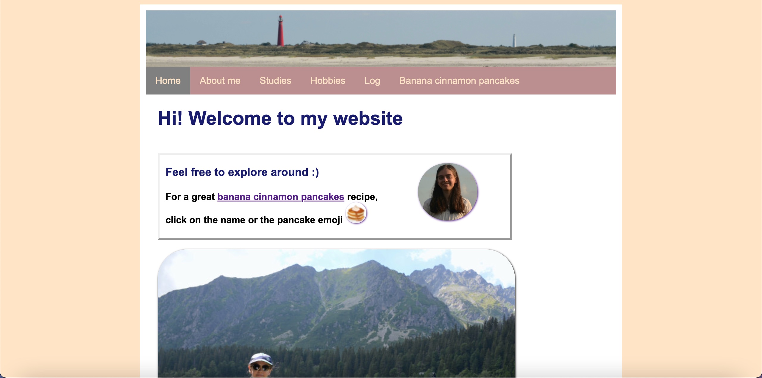
This particular website is not designed for scanning, as it lacks elements that contain a display of visual hierarchy. Furthermore, the important elements such as terms and pieces of text are made so that they stand out and attract attention, placing emphasis on them. conventions on this website are used optimally, the menu being placed at the top and with the contents of each page flowing nicely towards the bottom of the page. The elements and tools present that are clickable are visible, with the exception of the thumbnail and some other elements, although text mention that they can be clicked is added. The website has no distractions or design noise, looks and feels very minimalist and straight forward and is easy to navigate throughout.
Moreover, the texts are easy to scan, most of them being links that direct the user to other links or pages within the website. There is very little site of “happy talk” on the website, mostly introduction texts about the student on the home page.
The navigation is very simple and well put together, and is user friendly. The navigation menu is in the form of a horizontal bar that keeps the same layout throughout the pages within the website. It is also consistent, has the same display on all pages. It also includes a link to the home page on all pages. When on the afferent page, there is an indication to let the user know what page he is on at that instant. This is seen by term being highlighted in the navigation bar.
The home page does indicate what the website is about, as the text “welcome to my website” is clearly visible at the top of the page. And all the elements in the navigation bar indicate the content of the pages. The text “feel free to explore” gives a small sense of what a user can do on this website, and that is to browse through the present pages and links. Some minor improvements getting rid, or decreasing some of the image sizes on the site, just to add more text or just to give it more of a minimalistic feel, it feels like on some of the pages, the picture added are at the core and not what the page is about. Very good and neat website though, user friendly and easy to navigate.