The website is visually appealing and has a good visual hierarchy, where you can see all the necessary links to the other websites. I like how they have used organized the website, so that her name on the home page is visible at the top of the screen, but at every other website the top header changes, so for example in the Studies page, she put an About me header, which makes it easier to understand what the page is all about. It is very obvious what is clickable, so you can see the distinction between each link, and that each webpage has also displayed the important terms as the prominent ones. I feel like there is a distraction in the design since the page is very white, maybe they could add some more color in the background, and maybe on the webpage of Me where the image map is, it would be more optimal to write an instruction, that if you click on the eyes on the picture you can get redirected to another webpage, one might not know what do to or expect from the image otherwise. The conventions are also used optimally.
The texts are easy to scan, and they font size is visible to the eye without zooming in. For the pancake recipe, the text is very visible and I like how she used numbers to determine each step of the recipe. The links on the image map are also working, and I like that there is not much text on each page, she tried to keep it simple which I feel like she succeeded and fits her website design. I don't see happy talk. The navigation is user friendly, the spacing between the links helps to determine the websites, and I like the positioning of it at the top of the page. Every other page includes a link to the homepage, which is very important. The container that keeps the navigation menu is also a very good idea to help determine and separate it from the rest of the website. It is consistent, and it does include a link to the homepage. I don't see a "you are here indicator".
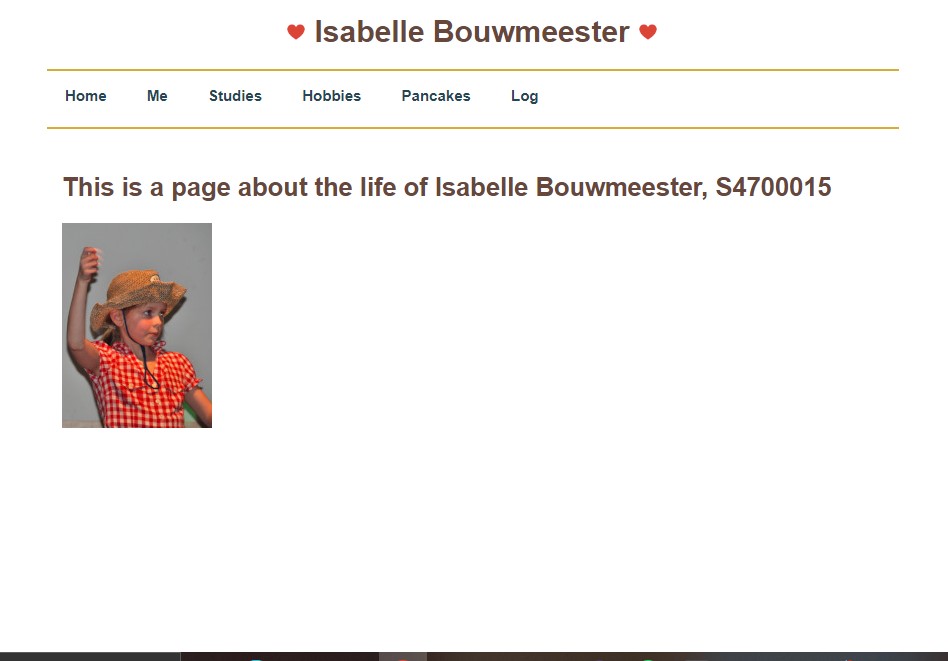
The homepage indicates what the site is about, it is all about Isabelle Bouwmeester and it indicates also what one can do in the site, which would be to have the option to navigate to other websites. I would suggest adding maybe some more pictures on Studies and Hobbies pages, just to make it more friendly and inviting. I would suggest maybe on the Me page to put the text that is underneath the picture somewhere more visible, because I didn’t know until later on that there was text at the bottom of the page, it was not clear to me. And as I mentioned before about including some more information about the image map and what to expect when clicking on the eyes, nose and ears. In rest, I think you did a great job with your first website.