Website Review
Review for Adriana's Website
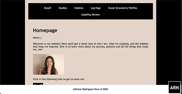
Overall, the website is clean and provides an easy user experience. The homepage clearly communicates what the site is about, giving an immediate idea of the website's purpose. The titles on each page are very clear, making it easy to understand the what the page is about. This is also improved by image elements that support the content on the page, like the main photo on the homepage and the video on the hobbies page.
The clickable elements on the site are obvious as they are mostly underlined. The navigation items are also clear and even highlight when hovered over. The design is simplistic, with no unnecessary distractions or design noise. The text has some bolded words, making it easy to scan. Titles and subtitles also improve the readability, and some of the subtitles have black highlights, which make them more eye-catching. Even though some of the text is a bit repetitive, there's no happy talk on the website and the tone is generally professional.
The navigation is quite user-friendly and is placed at the top of the page, and the items remain consistent across all pages. It includes a link to the homepage, and the current page is always highlighted, helping the user know where they are. However, there are two issues with the navigation. Firstly, it's not fixed in place and moves with scrolling. This isn't great for the user experience, as it requires you to scroll back to the top of the page to go to another page. Making the navigation bar fixed would significantly improve usability.
The second issue is that the "Usability Review" tab in the navigation is under all of the other items, which makes it look like it didn't fit in the navigation bar. This could easily be avoided by just making the text smaller, or getting rid of the black borders on the website and making the navigation fit the width. Even though the website is already responsive to the screen dimensions, the text size in the navigation could also be responsive to the screen size, otherwise all of the items will move down in a smaller screen.
I don't have any suggestions in terms of the user experience as it's overall easy to use. In terms of design, there are a few areas that could be improved. As mentioned, the black bars in the layout could be removed, and the entire background could be the a single color. This would also give the content more space on the website.
The beige tones are appealing but the black highlights and navigation can feel overwhelming at times. Replacing the black with a softer color like grey would maintain the contrast between the text and the background, while making the overall design cleaner.
In conclusion, the website performs well in terms of usability and clarity, but there is room for improvement in its design elements. Fixing the navigation bar so that it remains fixed while scrolling, fixing responsiveness for different screen dimensions, and refining the color scheme would really improve the appeal of the site.