Web Usability Review Saskia Cords
On this page, I will review Saskia's webpage and it will address the web usability.
Introduction
For the Week 6 assignment, we are required to review the colleague's website below us and address the web usability aspects discussed in the lecture.
Content
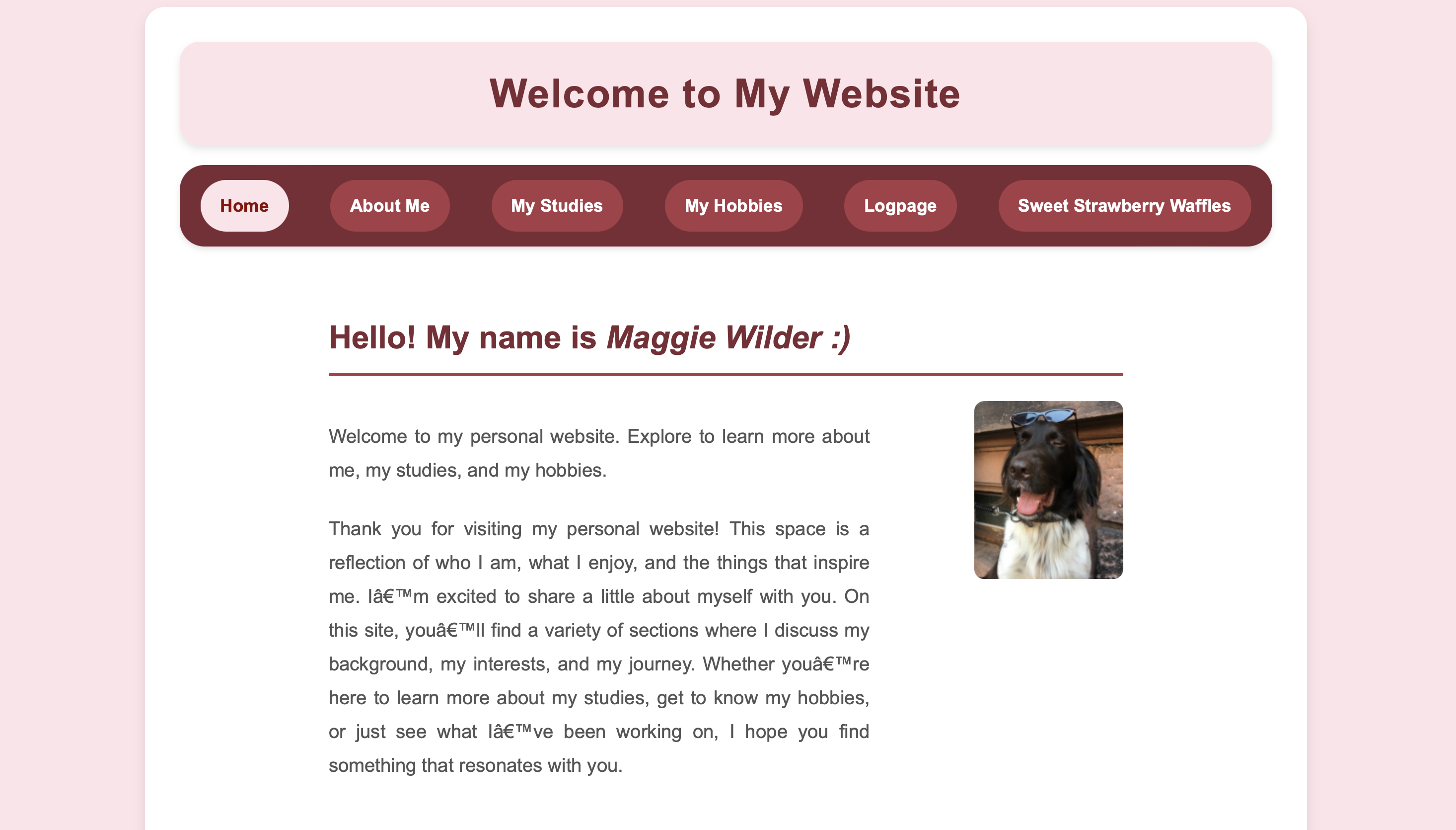
At first sight, Saskia's website is well structured and the main elements are both separated and catagorized accordingly, as in general websites follow a similar structure that Saskia presents on her webpage. When you arrive on her page, Saskia mentions clearly that this webpage belongs to her, and to gain even more information about her page, it states a clear and well-organised navigation menu that dives into the sections the website builds upon. Another interesting fact is that Saskia's website separates her name from the main content by implementing a full line, and only then Saskia goes further into the details on the main page. To add more clarity, Saskia added an image in order for users to get a better understanding of the owener of the website, which makes the website easily navigable.
Another interesting feature that cleartly makes Saskia's website unique is that the elements are clickable and obvious for the users to see when they click on a specific page of the website and therefore it is more appealing to the human eye, having a "you are here option" in the navigation menu to point out on which page the user currently is on. One of the things that clearly made me interested in Saskia's website is the use of colours, especially in the navigation menu, that clearly distinguish the pages between them.
Even though Saskia's website is well made, there are some things that could potentially distract the user from accessing or reading the website properly. One of the things that I would suggest is the font or the text or its size that could potentially be improved, given the white background on some pages where the text is used. By improving the layout of the text, users should have a better experience when navigating your website. Personally I enjoy the colors you used in your website, but for some users, the colors can be too powerful and therefore distract them from navigating.
Saskia's website, besides the really well-structured website, presents the information in a clear way and on point. Each page contains sufficient information in order to learn more about Saskia, with clear separations between the content presented. As a lot of the webpages present a lot of "happy talk", Saskia's presents the information in a clear way so that the user does not spend too much time reading before getting to the actual point. Furthermore, her website does include a link to her homepeage in the navigation bar menu.
Morever, Saskia's website is well centred on the page and makes the website easily navigable. This structure stays the same for all of the other pages mentioned in the navigation menu bar, with slight differencies in the text layout, but as previously mentioned, with a little improvmenet, the text can be more appealing to the user and therefore improve the image of the website overall
Conclusion
In conclusion, Saskia's webpage is well organised and contains elements that make the website easily navigable and enjoyable. If the suggestions mentioned in this review will be taken into consideration, then the users will definitely have a better experience when navigating thourgh Saskia's website.