 >Here you find Iulias website
On this page I will be reviewing the website of Ioana.
The website has an individual look and suits the interests of the person who made the website very well. Since Ioana is into astrology, she chose a background which compliments this and shows the universe/stars. Adding an own component makes the website very unique and makes it stand out from other websites.
In general is the layout of the different pages similar. The same background picture is being used for every page, as well as the same headings and font size. Therefore, it is more appealing to the visitor of the website, since it all has the same style. By using the same navigation bar on every page and highlighting the links, it is easy for the user to see where to click on, in order to get to the new page. This website is very user-friendly since it is well organized and easy to follow. It is straightforward and does not have too many unnecessary texts or pictures that would just confuse the visitor of the website.
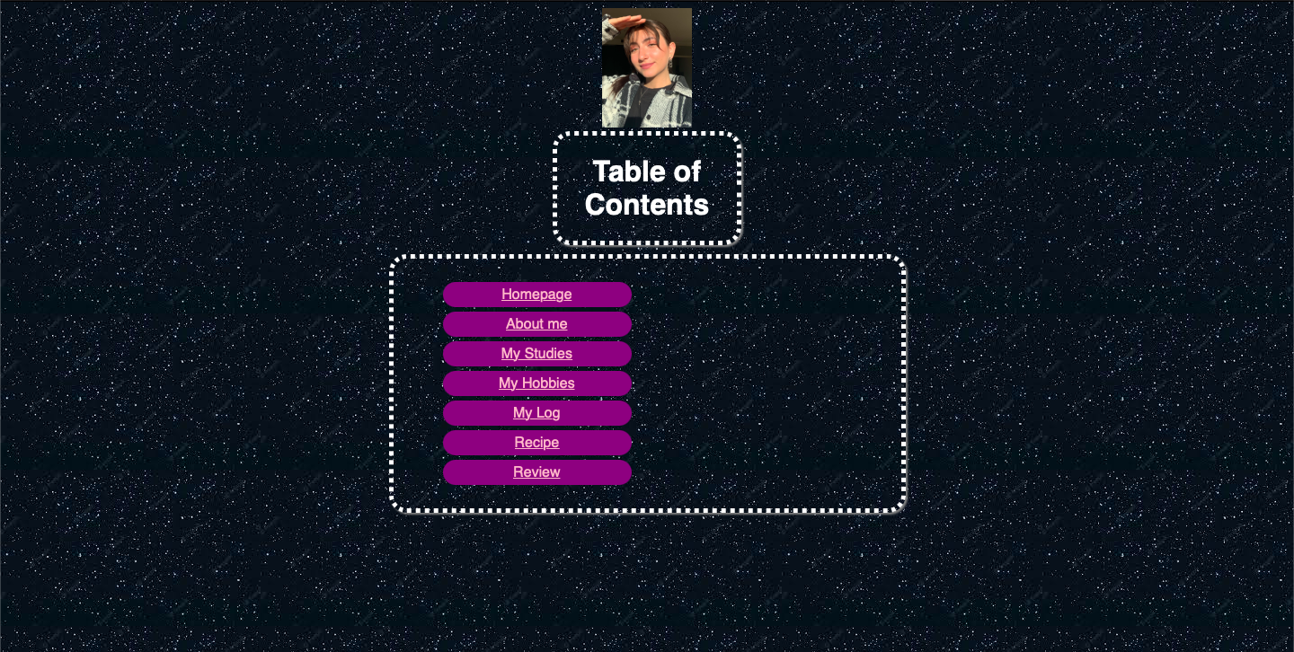
The homepage of the website is very simple, as well and therefore easy to scan. At the very top is a picture of the person, who made the website and beneath you can find the topic of the page in a big heading. Below that, you find the navigation bar, which has links to each of the different pages. It is very easy to scan through and get a good overview of what you can find on the website.
The links being used to direct the viewer to the different pages are also shown in a way that you can see right away where to click on. The texts that were being written are easy to scan and interesting to read. They have a good length to skim through it. It is not too long, so you would get bored and not too short, that you could not get to know the person. They are straight to the point and including all the information needed.
I really like this website because it is the perfect mix between being simple but still adding the uniqueness by complimenting the own hobbies, with the help of the background picture. I personally like more simple and plain websites, rather than websites where you can easily get lost at. When it comes to improvements, there are just small things such as sticking through the same heading. In general the same heading was being used, talking about style, font size etc. except on one page, which is the banana cinnamon pancakes page. These are just small things, that could be improved so it would look completely alike. Besides that, you could put the different links on the homepage in the center of the box, rather than on the left side. But as I said, those are just small adjustments that could be made to polish the website.