USABILITY REPORT OF KIA'S PAGE
This is a usability report for Kia's webpage which will elaborate on different factors.
There is a lot to see when first opening Kias page. The bright colour changing bar and background of the homepage catch the eye right away. The user is welcomed with thick black letters and his face, which leads to the about me section if its clicked. This is not made obvious, but I interpret it as a hidden link, as the same section is clearly reachable through the well structured header. The design choice is coherent on all pages, even though I would have choosen another font or text color with the constantly moving background, as it makes it hard to read at times. Furthermore, the user has to scroll to see the full contents of the page, I would recommend using a smaller scale or choosing a different hierarchy for better usability.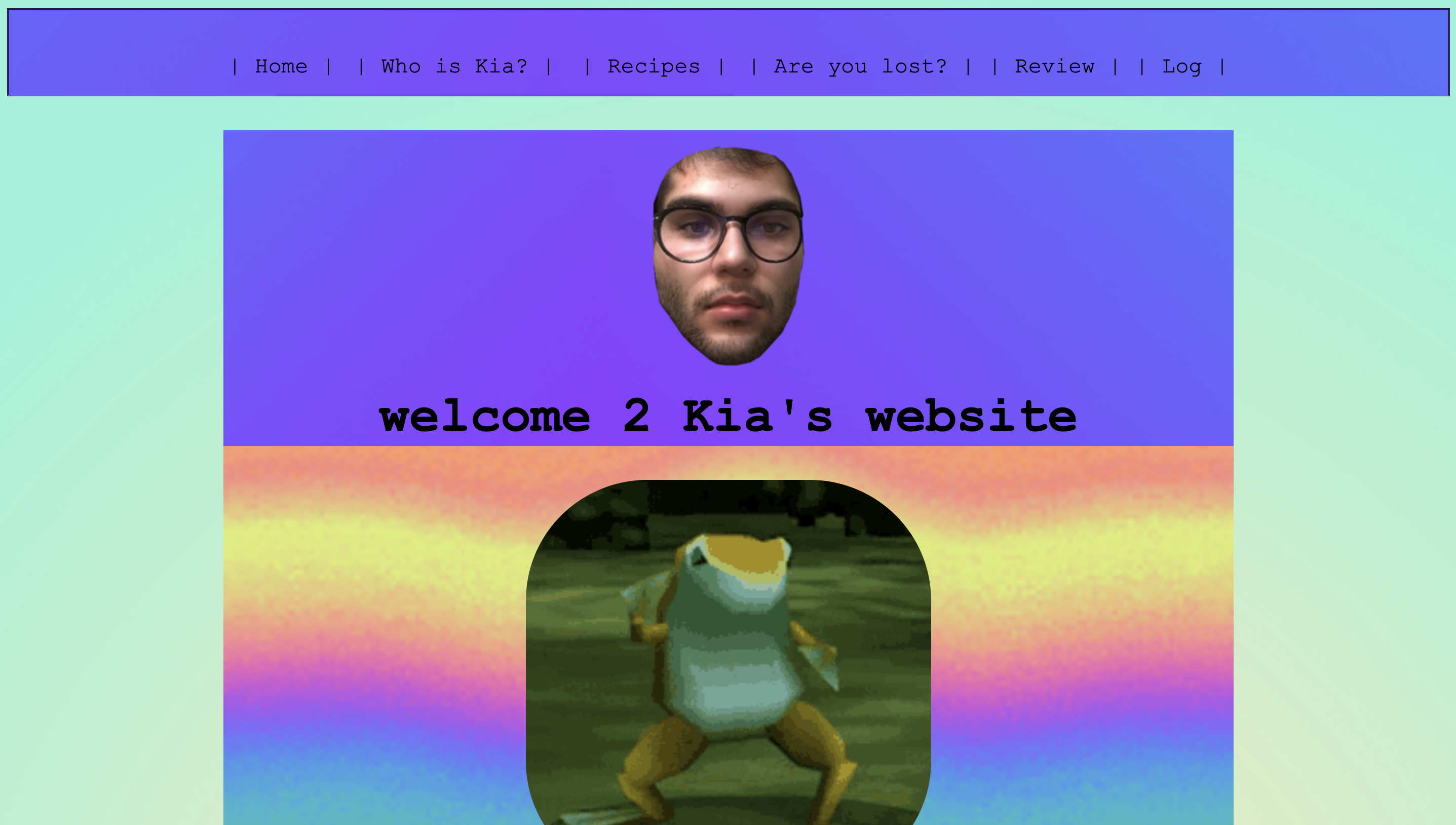
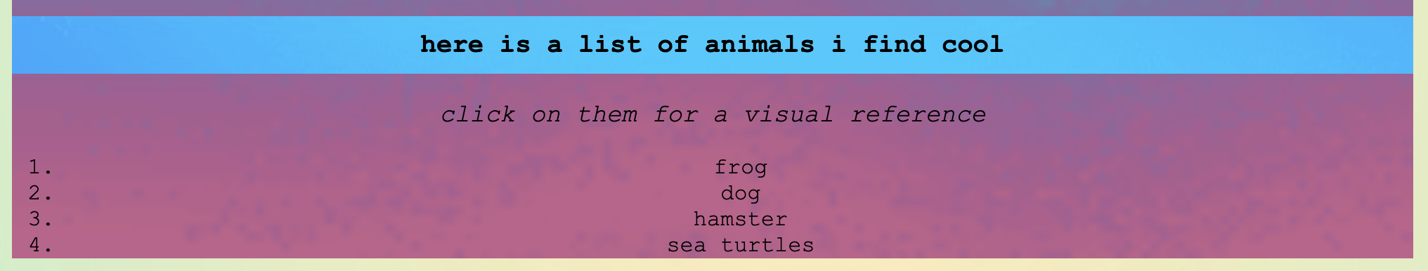
The texts are short, and easy to read, with clearly differentiated headings. In the recipes there is a clear distinction between different parts of the recipe which makes it easy to follow. In the recipes the instructions have a lighter background which makes it easy to read. I would recommend doing the same for the other texts to improve visibility. Apart from the previously mentioned hidden link all other clickable items are clearly indicated in the text, through strategic positioning or hyperlinks. The fixed header enables to user to navigate through pages effectively. Most of the time the current position is detectable through a heading on the subpage, but in some cases the heading is slightly different from names on the links in the header. This could be improved by letting the color in the header switch to the color it has while hovering over the link if clicked. The structure of the subpage ‘about me’ could be slightly improved by changing the structure or indicating the two texts as different texts through different backgrounds, as the text is interrupted by big elements. I did like the fun addition of the included list of liked animals.
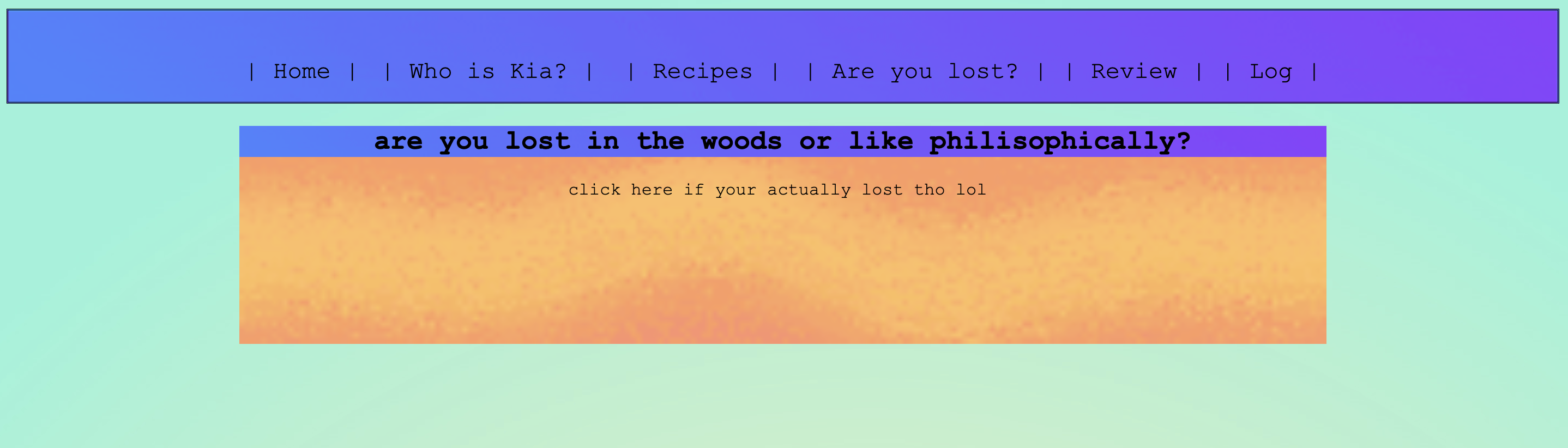
There is some happy talk included, but the protruding tone in all the texts is a sense of humor which makes the stay on the webpage enjoyable. Particularly I enjoyed the section that asks you if you are phylosophically or physically lost and leads the user to google maps.
To conclude, the website clearly indicates its purpose and function, guidance works well and all main elements can be found. The design choice is coherent on all subpages, even though it may be slightly distracting. Another point that would improve the visual experience would be a layout that shows the full element on on page without scrolling. Overall I did enjoy the experience of visiting this website, mainly because of its humouristic aspects.
back to homepage