Website Link
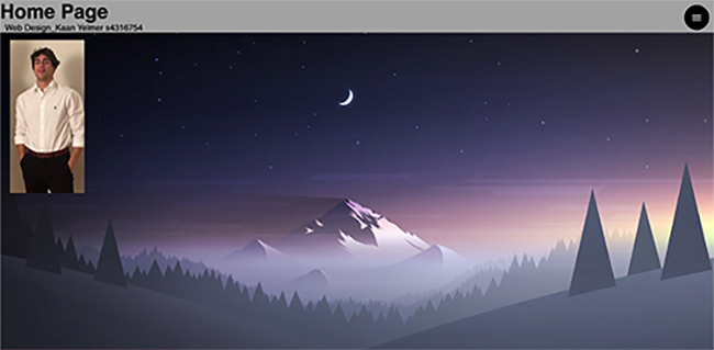
The home page is very simple which I like and it makes it easy for the audience to understand. The same style is kept throughout the whole website which makes it smooth transitioning throughout the different pages of the site.
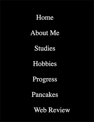
I like that the navigation bar is only visable once clicking on the 3 lines on the top right. This allows there to be more space on the page and not have it constantly in the viewers face. it is also very straightforward and easy to understand by the viewer so that they know where to go
The site can improve by making it clear what is clickable and where you should click to be taken to a new page. For example my mouse was able to click all over the homepage to go to the bigger version of the thumbail. This could confuse some viewers thinking there is something to be clicked at all times. Another improvement could be to add more pictures throughout the pages. Viewers will always find it easier to go through a website that is visually pleasing than to read a lot of text.The text in the website is not so easy to scan as they are big paragraphs of texts and very much close together. Also another reason it is not easy to scan is because it is in Latin which not everyone can read but I am aware that this is a generated text as he mentioned in his progress log. When navigating through the website, the user always knows where they are as it says it in the top left of the screen. The Homepage makes it clear that this website is about himself because of the picture of him and by writing his name but it could have been better by adding a header saying what the website is actually about. Users might get confused by reading only homepage and not knowing what the homepage is about. In general, this website can improve by adding more images and showing more about Kaan himself as now I can only talk about the design of the website and not so much about the content.